Choosing Inks for Color Printing – Spot Color vs. Process Color
COLOR PRINTING: For those who aren’t trained in printing or graphic design, it can all get very confusing. Most people who are taking the “Do It Yourself” approach to setting up files just look at colors on the computer screen, with maybe a handful that have access to a Pantone guide, but not really understanding it. If you’re not familiar with how ink works and how colors are made, you could end up with some very UNEXPECTED results. This is the first of a series of blog posts that will hopefully help make sense of color, and how color is made in the world of commercial printing.
Spot Color vs. Process Color
When you’re talking about Spot Color you’re pretty much talking about the Pantone Matching System. Pantone created their Color Mixing and Color Matching system back in the 1960’s and it’s largely been accepted as the worldwide standard. All colors are mixed using the 14 mixing inks below. If you have a Pantone Formula Guide, they’ll be on the first 2 pages. In most Adobe applications, it’s the first 14 colors listed in their Pantone Swatches.
| PANTONE Yellow PANTONE Purple PANTONE Yellow 012 PANTONE Violet PANTONE Orange 021 |
PANTONE Reflex Blue PANTONE Red 032 PANTONE Process Blue PANTONE Rubine Red PANTONE Black |
PANTONE Blue 072 PANTONE Warm Red PANTONE Green PANTONE Rhodamine Red |
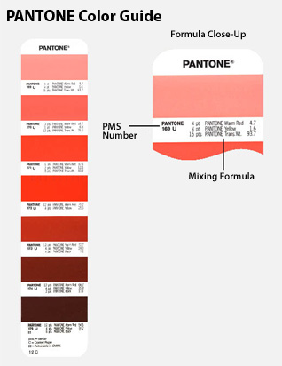 Combinations of these colors, with the occasional use of PANTONE Transparent White, make up all the colors of the Pantone series. Kind of like paint chips at the hardware store, each color has a specific formula or recipe. A few key points to keep in mind:
- Printing Inks are NOT opaque! They are slightly translucent, which means the color of the paper effects the color. So PANTONE Blue 072 looks one way on white paper, but on natural, off-white, or colored papers it would pick up some of the color of the paper.
- Transparent White is NOT “white” ink…. but is actually CLEAR. As mentioned before, ink is translucent, so when you add “clear” it allows more of the paper to come through. This makes the color look like a lighter shade.
- Each different color is a different ink, including Black. So if your project is PANTONE 286, PANTONE Red 032, and Black, than it is a 3 color job and requires 3 plates.
Process Color works a little differently. For “full color” printing, it uses 4 inks (Cyan, Magenta, Yellow, and Black) to produce a variety of other colors.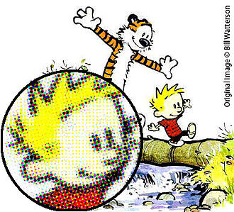
If you own an inkjet printer, or have ever used a color copier, you might already be familiar with this. With Process Color, the inks aren’t mixed together to produce different colors as with Spot Colors. These colors are created with a series of half-tone dots in each of the 4 inks as needed to create the desired color. The inset to the right helps illustrate this point, and can generally be seen in any color older comic strip or comic book. Some magazines and art prints show it too, though the resolution tends to be higher, so you might need a magnifying glass of some sort.
Hopefully this clears up a few questions regarding the way Spot Colors and Process Colors are used in commercial offset printing. Future blogs will continue to explore other ink and color topics, such as Coated vs Uncoated, RGB vs CMYK, metallic inks and more. If you’d like to see any specific questions answered about inks used in printing, please leave a comment below.
![]()
Universal Printing
Offering quality printing and communications solutions to
Raleigh, Durham, Chapel Hill, and the Triangle since 1979.
www.universalprinting.com
Tags: Adobe InDesign tips, commercial printing, graphic design, printing, setting up your files, tips and tricks