Choosing Inks for Color Printing – Coated vs. Uncoated
If you read our previous blog post, you should know the difference between Spot Colors and Process Colors and the role they play in commercial printing. Just to recap a few points:
- Spot Colors are blended from any of 15 different base inks
- Process Colors are made by using different percentages of the four process inks
(Cyan, Magenta, Yellow, and Black) to build colors - Even when used as a solid, ink is slightly translucent, not opaque
Coated vs. Uncoated
If you have a Pantone Formula Guide, or if you’ve used any design programs like the Adobe applications, you know that Pantone colors are listed by number. For example, PANTONE 185 is a bright red, while PANTONE 355 is kelly green. These colors have a letter after the number, C or U. Older programs might tag these colors as CVC or CVU (for “Computer Video Coated” and “Computer Video Uncoated”), but this has largely been abandoned. Either way, when you see these letters they refer to the type of paper. C stands for “coated” and U stands for “uncoated.” In some rare instances you might see an M for “matte,” which is still technically a coated stock. In the world of Pantone though “coated” means GLOSS coated… as in, shiny paper. In this post, when you see “coated” you’ll know we mean “gloss coated.”
Coated papers have a smooth finish, where the paper is pressed and polished while hot or steamed during the manufacturing process. This coating makes the paper less absorbent and takes ink better. Think of it as the coat of primer you’d use before painting your walls.
 Uncoated paper is just that; paper without the coated layer. It’s often used for letterhead, printer paper, copy machine paper, etc. Sometimes it will be classified as “bond” or “writing,” but those are just other ways of saying “uncoated.” it’s fair to say, if coated paper is less absorbent (like a wall with primer) than uncoated paper is MORE absorbent (like a wall WITHOUT primer!)
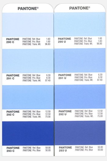
Regardless of whether a color is C or U, the ink is made the same. The image to the right shows that PANTONE 293 C and PANTONE 293 U look very different, but are made from the same formula (equal parts of Reflex Blue and Process Blue.) Since coated papers allow the ink to sit on the surface, it remains rich and vibrant. The uncoated sheet allows more ink to be absorbed into the paper. Sometimes the minerals used as pigment to color the inks effect how it will absorbed and also effects the color.
Notice PANTONE 290 C and PANTONE 290 U are closer in color. This color is made mostly from Transparent White (which you’ll remember is essentially “clear” and allows more paper to show though the ink.) Since only 3.2% of the mixture is actual pigmented ink, it’s less affected by the coated and uncoated paper. As a result, coated and uncoated versions of lighter colors like yellow and light shades of blue, red, or green, will match more closely, while darker shades and colors will look different… sometimes VERY different.
In fact, some designers will go as far as to choose different spot colors for their files, depending on the stock that’s used. PANTONE 710 U don’t really match PANTONE 710 C very well, but PANTONE 185 U does match fairly well.
The color difference in coated and uncoated stocks is also true for Process Colors, though for slightly different reasons. Process color allows a wider array of colors due to using halftones and blending tints of each process color. Everything is made up of dots; big dots, little dots, but dots nonetheless (if you need a visual, check our previous blog Spot Color vs Process Color.) These dots of varying sizes are more likely to be effected by something called “dot gain.” Remember how uncoated stocks are more absorbent, which means they will be more likely to cause the ink dots to swell slightly? This is dot gain. Most everyone knows the Bounty Paper Towel commercials, where the paper towel is used on a small spill and as the towel absorbs it, the spot on the towel spreads out. Ink on uncoated paper does a similar thing, so a halftone dot of magenta that’s set for 50%, could swell up to 55% on some stocks and causing the color to shift slightly.
The bottom line is, whether you choose a coated paper or an uncoated paper for your project, you’ll want to work closely with your Customer Service or Sales Representative. They can always provide you with coated or uncoated chips of different Pantone colors. You can also request a Press Proof, where you can see your job running on press and review the final version for yourself.
![]()
Universal Printing
Offering quality printing and communications solutions to
Raleigh, Durham, Chapel Hill, and the Triangle since 1979.
www.universalprinting.com
Tags: Adobe InDesign tips, commercial printing, graphic design, printing, setting up your files, tips and tricks
Great article, I often get asked what the U and C stand for, I knew it was coated and uncoated but I never really understood what it actually meant.
thanks for nice explanation
Thanks for such a great explanation – you’ve answered so many of my questions!
Very good, simple, useful article.
Thanks for the explanation. Interesting that some designers choose different pantone colours depending on the stock in order to get a more consistent colour between paper types. I’ll bare that tip in mind.
Nice blog.
It is very good knowledge for designers.
Hello
I wanna some information about the printablity coated paper
thanks